Inclusive Wealth Building
Unveiling the geographic disparities in wealth from non-labor income
TEAM
Periscopic
YEAR
2021
MY ROLE
Design Strategy, Visual Design

Summary
Project Overview
In partnership with the Economic Innovation Group and their Inclusive Wealth Building Initiative, this project addresses economic inequality by examining the geographic concentration of income-generating assets such as dividends, interest, and rent. View the full project here.
My Contributions
Expanding on initial conceptual thinking, I helped determine effective ways to present the data, adapted client brand guidelines into a project-specific design system, and collaborated across teams to structure the interactive experience.
What We Created
Core components and features of the project
Scrolling Narrative with Supporting Visuals
Organized into several chapters, the narrative guides users through the subject matter, explaining how the widening gaps in asset ownership serve as a critical indicator of financial stability that enable individuals to prepare for emergencies, plan future goals, and engage in the economy beyond their earned wages.
Animated Insights
As users scroll through the narrative, the map dynamically pans and zooms to geographic locations in tandem with the narrative and other interactive elements. The panel was designed to slide in at specific narrative points with contextual details and fade out as the narrative progresses.
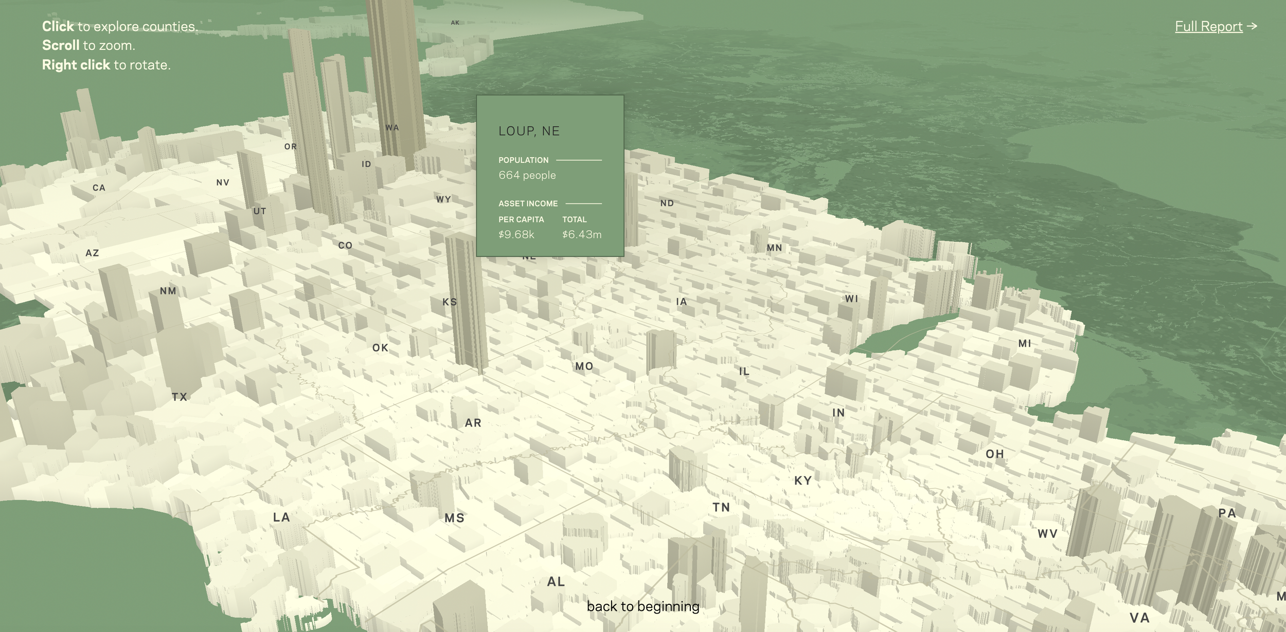
Explorable Map
Reaching the conclusion, the background map shifts into an interactive tool, enabling users to explore asset wealth at the county level across the US.
How We Got There
A bit about the design process and my thinking
Design Strategy
Building the Narrative
Using the report that would serve as the project’s foundation, we familiarized ourselves with the subject and began shaping the narrative, while the data team explored the data in depth. When a client targets a general or informed public, I view my acclimation process as a test of how well the information is communicated. I pay attention to anything unfamiliar, unexpected, confusing, or difficult to grasp, as well as technical language and moments of clarity.
We also prioritized key audiences—political press, policy staff, and the general public—to clearly communicate the importance of this asset-based income and its role in the growing disparity of wealth.
Early brainstorming of potential design elements
Information Architecture
Supporting the Narrative with Contextual Insights
Once the core elements were established—the dynamic map and narrative outline—I focused on the strategy and design for contextual information that would improve comprehension of the subject matter.
This took shape as a side panel that complements the map and narrative by revealing definitions, contextual details, and region-specific insights. Bar charts were an ideal choice because of their broad familiarity and ability to clearly highlight income disparities. To expedite the development process, I produced the animations using Adobe AfterEffects.
Visual Design
Varied Interaction Paths and Visual Treatments
To diversify the presentation and retain engagement, we designed individual modals for local vignettes that viewers can select or bypass while scrolling. Each modal uses a time series graph to showcase how non-labor income can differ significantly between two neighboring counties. We also established a visual through line by integrating bars into the time series graphs that mirrored those in the side panel.
These examples also serve as a guide for users, demonstrating how to use the data for comparisons and preparing them for the interactive map in the final section.
Case studies were woven into the narrative that users could select to read more or continue scrolling to skip
Inverted map with highlighted locations that support the narrative