Women Can Win
Shedding light on the gender gap in political leadership
TEAM
Periscopic
YEAR
2020, 2024
MY ROLE
Concept Development, Information Architecture, Design Strategy, Visual Design

Summary
Project Overview
Motivated by the 100th anniversary of women’s right to vote, this project aimed to inform the public about the current state of women’s representation in Congress, promote women’s leadership, and encourage voter participation. The deliverables included an article and a series of data visualizations that illustrate women’s presence in Congress, highlighting their representation by state, racial and ethnic diversity, and party affiliation. We updated and expanded the project in 2024 to compare representation progress and explore where women are running for congressional seats.
My Contributions
As one of my first projects on the Periscopic team, I jumped into this project while the initial concept and approach were coming together. From there, I was the lead designer, responsible for refining the concept and collaborating with our data team and creating the final visuals. Some specific contributions included establishing the overarching visual aesthetic, determining effective data presentation methods, and bringing the final visuals to life.
I also served as the lead designer for the 2024 adaptation of the original project, responsible for the concepting and strategy of the new direction, copywriting, and production of the final visuals. This version expands on the original concept with updated visuals that reflect 2024 data, new elements that offer deeper insights, and additional visuals.
What We Created
Core components and features of the project
2020
Unlike much of our work, which often includes interactive components, we focused on static visualizations where we could prioritize clarity, accessibility, and narrative depth. Based on our research, we centered the visuals around three core themes: the number of women in Congress, their demographic makeup, and their political affiliation—each offering a different lens on representation in U.S. leadership.
We’ve always believed that context is essential to making data meaningful, and framing the visuals within an accompanying article gave us space to weave in insights, highlight notable patterns, and explain why these trends matter.


2024
To assess progress over the four years between projects, we expanded the visual system with new symbols and treatments to highlight what had changed, rather than simply updating the visuals with new data. Additionally, we introduced two new charts to visualize women running for Congressional seats. The new article reflects on this added perspective as well as the progress of women’s representation since 2020.
How We Got There
A bit about the design process and my thinking
Concept Development & Design Strategy
Choosing Our Focus
With most internal projects, close collaboration across teams is an essential part of prioritizing impactful elements and crafting a cohesive story. The data team led much of the research process, working to find credible and comprehensive data sources. Part of that exploration included looking at state and local government positions. However, we decided to narrow our scope to focus only on Congress, as it represents the highest levels of leadership, resonating with a broader audience and be more effective for sharing on digital platforms.
Connecting Past Progress and Future Paths
Delving into the past helped us identify the most important stories to tell, with the intersectionality of race and gender emerging as a meaningful narrative to highlight. While often overlooked, women of color played a pivotal role in the suffragette movement, despite facing compounded discrimination. Their representation in positions of leadership remains crucial for advancing gender and racial equality.
We also found it important to acknowledging the work that still lies ahead. To inspire action, we provided a snapshot of what gender representation could look like in the future based on the historical rate of progress and a path that accelerates support for women in Congress.
Expanding the Project
Research, Strategy, and Design
For the 2024 update, I wanted to visually explore how women’s representation in Congress changed since 2020—and challenge myself to develop a consistent visual system that could be applied across the new graphics. Just as importantly, I wanted to address a common assumption: that women may be underrepresented simply because they aren’t running. To push back on that idea, I focused not only on how many women were running for office, but also who they were running against.
This context matters for two key reasons. First, running against an incumbent—especially one with established name recognition, funding, and political influence—is a significantly steeper challenge than running for an open seat, particularly when the incumbent is a man. Second, if a woman (or multiple women) runs for a seat already held by another woman, the overall number of women in Congress won’t change, no matter the election outcome. Including this nuance helps highlight that while progress toward equal representation may appear slow, it’s not for lack of ambition.
Adding More Perspective Through the Narrative
As the design lead for the 2024 project, I was also responsible for writing the narrative. Throughout the research and design process, I kept track of key insights and standout statistics that I felt were important to highlight. These points helped shape the structure and tone of the narrative, grounding it in both data and context. I wanted the story to do more than present the numbers—I aimed to surface some of the structural barriers that often go unseen, while also underscoring the persistence and progress of women who continue to pursue leadership roles despite those challenges.
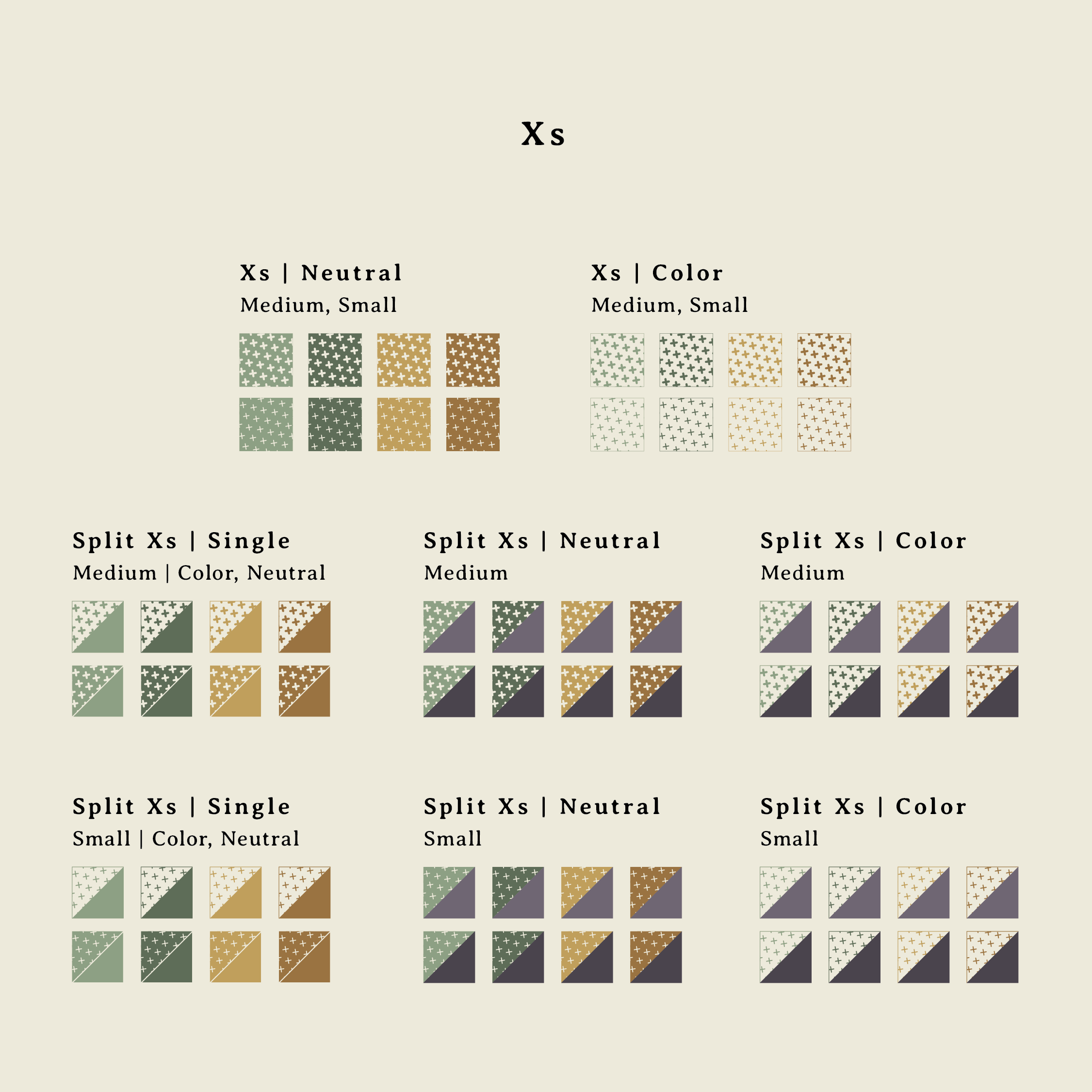
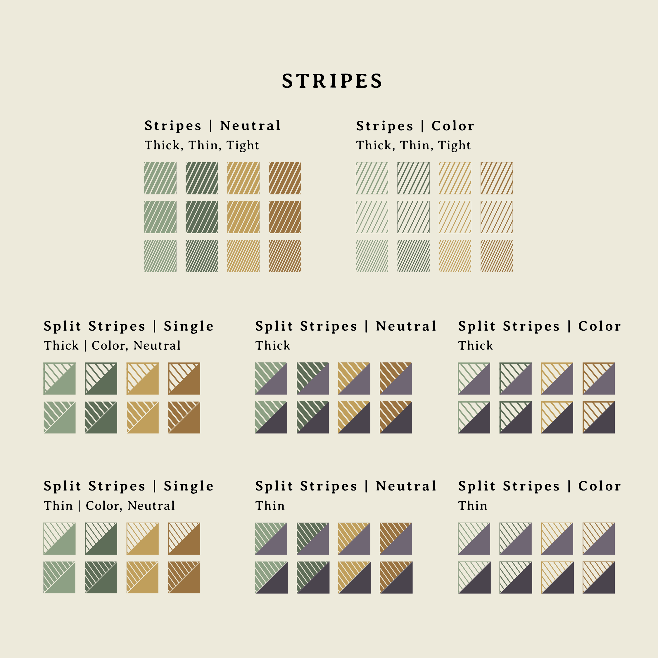
Comprehensive legend of the expanded visual system that shows changes between 2020 and 2024
Solving Design Challenges
Avoiding Misleading Visual Implications
Our goal wasn’t to track individual congressional seats over time, but to show how the overall makeup of Congress has shifted across specific categories—such as race and ethnicity, or party affiliation. We used color to represent these different dimensions, applying it to each seat within a given theme. But when viewed across the full set of visualizations, this approach risked creating an unintended additive effect. For example, a single seat might appear as representing a woman of color in one chart and a Democrat in another—suggesting, incorrectly, that it belonged to a specific Democrat woman of color.
To prevent this kind of misinterpretation, we intentionally varied the seat arrangements in each visualization. Some were stacked vertically, others arranged horizontally, or split left and right—visually reinforcing that each graphic offered a distinct perspective rather than layering multiple attributes onto the same individuals.
Accommodating New Data
A common challenge with long-term data projects is adapting to changes in how the data is structured and measured. First, after the original release, updates from the U.S. Census changed the number of House seats allocated to each state. This required us to adjust state totals and distribution of states—from most to fewest seats—ensuring the accuracy and relevance of our comparative analysis.
The second, and more nuanced, challenge stemmed from changes in how our demographic data source categorized race and ethnicity. The updated methodology allowed individuals to identify with more than one racial or ethnic group—introducing, for example, members who identified as both White and Latina. This presented a complication for our existing visual system, which was designating seats as either White Women or Women of Color.
Representing this group appropriately—and equitably—became a critical design and ethical consideration. We engaged in thoughtful discussions about the responsibility of visualizing race and gender in data and explored a range of solutions, including introducing new symbols and colors altogether. Ultimately, we chose to apply the visual treatment of both White and Women of Color categories, giving equal representation to both selected identities and maintaining visual cohesion.
Various arrangements of House seats across visuals
Visual Design
Exploring Creative Directions
With no client requirements, I had the freedom to explore open-ended creative directions. Drawing inspiration from the project’s historical roots, I researched the suffragette movement and experimented with typography, color, and visual motifs to build a design language that both honored the legacy of the movement and supported clear data presentation.
The final aesthetic was intended to evoke a sense of the past. I chose a warm, muted color palette—especially off-whites reminiscent of aged parchment or weathered paper—to subtly convey a feeling of time and authenticity. Gold, inspired by the sunflower and symbolic of hope, was a central color in the U.S. suffrage campaign and served as the project’s foundational hue. Green and purple, prominent in suffrage movements internationally, were used as complementary accents that deepened the historical connection.
Typography played an equally important role in shaping the tone. While much of the era’s type leaned toward bold Art Deco styles, modern interpretations often carry a glamorous, ornamental feel that didn’t align with the grounded, serious nature of our content. Instead, I selected a more modest serif typeface reminiscent of those found in the pamphlets and essays circulated by suffragists. With letterpress-inspired forms, slight irregularities, and classical proportions, the typography stayed true to the historical tone and reinforced the grassroots nature of their advocacy.