Celebrating Men’s Health
Showcasing the impact of supporting men’s well-being
TEAM
Periscopic
YEAR
2021
MY ROLE
Design Strategy, Information Architecture, Visual Design

Summary
Project Overview
In partnership with Movember, this project was a refresh and enhancement of their Impact Hub, which Periscopic created and maintained for several years. The redesigned platform needed to expand its capabilities, allowing supporters to explore the outcomes of their contributions, see how donations are utilized, and motivate new supporters to invest in men’s health initiatives. View the full project here.
My Contributions
Shortly after joining the Periscopic team I took part in the third phase of our Movember work. My focus was on developing the design strategy and overarching design system for Movember’s project pages, which provide insight into each of their initiatives. This included defining an information architecture that could support long-form content, quotes, images, videos, and categorical details. I created early wireframes, integrated the brand’s visual language, and delivered mockups to communicate the finalized strategic and visual direction.
What We Created
Core components and features of the project
Engaging Navigation
In line with Movember’s identity, we sought to highlight the organization’s unique approach by breaking away from conventional methods. Rethinking traditional navigation, we designed a dynamic and engaging space that allowed users to explore content in a nonlinear fashion, find specific details they were looking for, and discover other related work that might capture their interest.
Project Pages
Project pages aimed to highlight the impact of funds and funders, rather than focus on additional fundraising. Each page prioritized an impact-based introduction, followed by statements about the problem each initiative is addressing, and meaningful calls to action.
How We Got There
A bit about the design process and my thinking
Design Strategy & Information Architecture
Showcasing Impactful Work
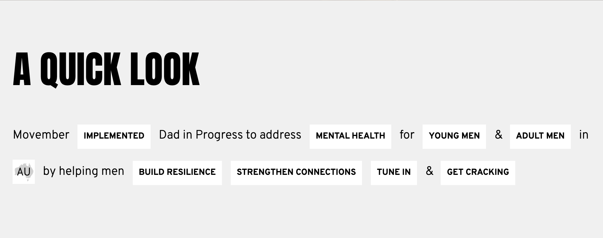
Movember's projects span different types, scales, and cause areas, all aimed at supporting men's health. Each project page needed to provide a high-level view of how each project aligned with broader efforts like cause areas or healthy behaviors. Additionally, pages had to include specific details such as problem statements, impact statements, statistics, and testimonials, while also incorporating rich media, a key part of Movember's identity.
Given the need for page structures that were both flexible and cohesive while accommodating a substantial number of pages, I structured the pages using a modular strategy. This approach ensured visual continuity across all projects, even compensating for outliers with minimal or extensive content, by determining which components could be omitted while maintaining the system's integrity.
Taking a Modular Approach
Each piece of information was treated as a module that could be combined in different ways, either as a cohesive set or as individual elements. I anchored the design process around one project with all of the components I would need to design for, and then considered how these components would work together for projects that needed fewer components. See how the final page came together.
Early project page wireframes.
Refined mobile and desktop mockups of project pages
Visual Design
Focusing on Real Impact
To foster empathy, I made photography central to the visual hierarchy, blending key information like impact statements directly with the images. Instead of treating text and photos as separate elements, I chose to overlay content on scroll, subtly reminding viewers that real men and families stand behind these stories. Pacing and motion also added a human touch, with strategic visual pauses, layered components, and staggered text, all working together to reveal personality and emphasize the most important details.
Designing the Details
Throughout the development of the modular system, we found that categorical details, such as location, which initially seemed crucial, became less prominent compared to more impactful information. As a result, I created a revised system where these details occupy less space and are grouped together rather than scattered across the page, ensuring they remain visible but not overwhelming. I designed a concept reminiscent of Mad Libs for the categorical details, with styling adapted from the navigation elements—a playful approach that the client found especially engaging.