Choices
Illustrating the awful choices faced by Sub-Saharan African farmers in extreme heat
TEAM
Periscopic
YEAR
2024
MY ROLE
Concept Development, Design Strategy, Visual Design

Summary
Project Overview
This project highlights the difficult decisions faced by agricultural farmers in Sub-Saharan Africa as they contend with increasingly extreme heat due to climate change. It sheds light on the harsh realities of working in such conditions, where each choice has significant consequences for both livelihoods and health. Visit the full project here.
My Contributions
For this internal Periscopic project, I played a key role in developing the concept and deciding how to effectively use the data so it resonated with the project's message. I focused on designing interactive elements and shaping the visual design while closely collaborating with our data team.
What We Created
Core components and features of the project
Context for Critical Choices
The project aims to build empathy and convey the overwhelming reality faced by farmers who must choose between working in unsafe heat or the consequences of not working. It opens with a brief narrative that sets the stage for African agricultural workers’ experiences, leading into an interactive component that puts users in their shoes.
Stirring Empathy Through Simplicity
After the opening narrative, users enter the interactive portion where they begin making choices themselves. They start by selecting a country and season, which generates the number of times a worker in that region is likely to face the decision between protecting their health or securing their livelihood during that period. The choices are presented one by one to emphasize the frequency and weight of these decisions. Once complete, users are shown a summary that places their experience in broader context—highlighting how widespread and persistent these tradeoffs are for agricultural workers around the region.
How We Got There
A bit about the design process and my thinking
Concept Development & Design Strategy
Selecting the Data
While we’ve worked with a range of climate change adaptation data, one dataset repeatedly stood out: the loss of safe working hours. Unlike typical agricultural data focused on yield, this metric linked climate conditions directly to human experience, making the impact of extreme heat more tangible.
While invaluable for climate professionals, the data itself was clinical—reporting the percentage of an hour that becomes too dangerous to work. For example, during Nigeria’s planting season, noon is unsafe 24% of the time. But what does that really mean? How do we convey the unpredictability of these conditions and their human impact?
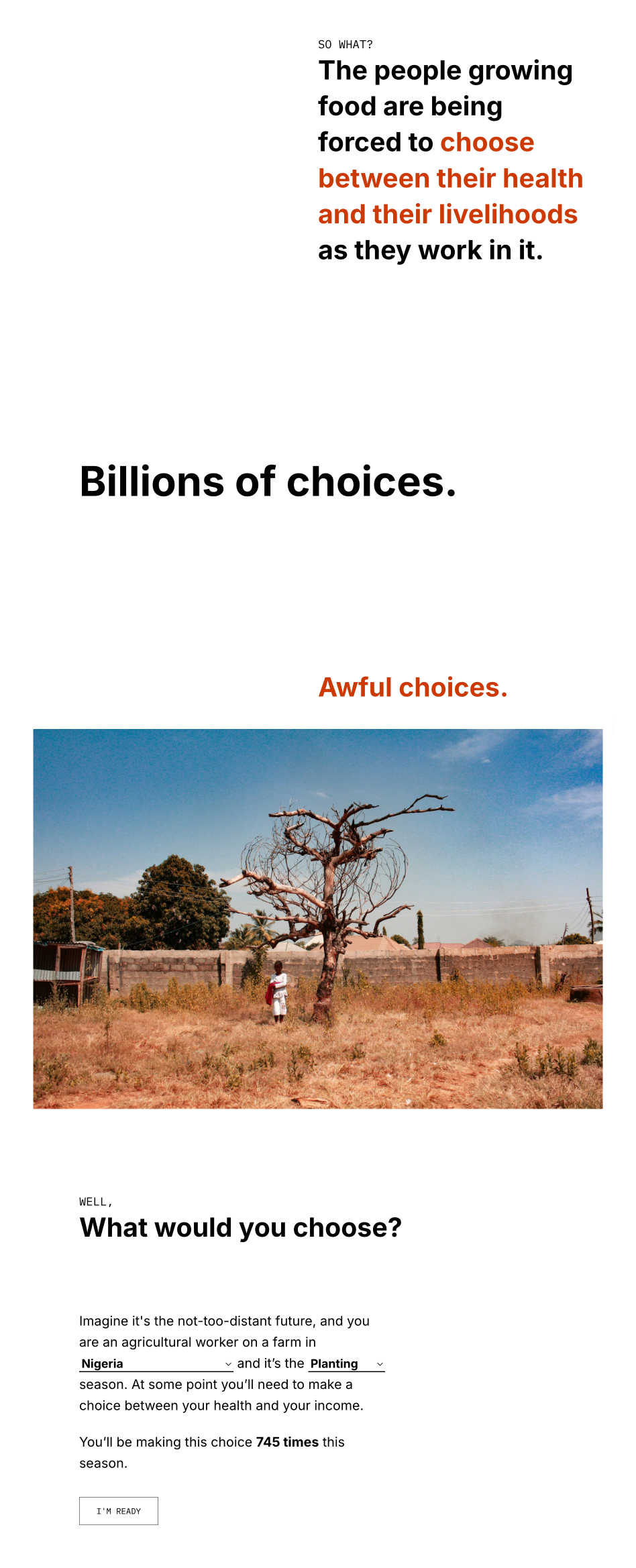
Focusing on Human Impact
Having curated much of the photography for our other projects on climate change adaptations in African agriculture, I drew from a rich archive of climate adaptation initiatives with images of agricultural landscapes, farming techniques, and, most importantly, the people. In shaping our design concept, I pictured the agricultural workers I had seen repeatedly in the images and imagined myself in their situation—facing an hour too hot to work. It’s not a data point; it’s a choice with real consequences: endure unsafe conditions or stop and bear the cost.
We carried this perspective forward, reframing the hours in the data as choices. This helped transform abstract data into a more human-centered narrative, making the impact of climate change more tangible.
Figma prototype logic
User Experience & Interface Design
Designing for Difficult Decisions
We wanted to convey the unpredictability and real-life consequences of the data in a more narrative-driven format—moving away from the strictly professional tone in which it was originally presented. To do this, we developed a set of scenarios that reflect the difficult decisions agricultural workers face when choosing whether to work in unsafe heat conditions. The choices are simple, but the stakes are high—often unpredictable and with limited foresight into how each decision might compound over time.
To encourage engagement without overwhelming users, we designed the experience to allow them to make three choices, after which they could opt to auto-complete the rest of the scenario. This struck a balance between immersion and accessibility.
To test the effectiveness of this approach, I created a high-fidelity prototype in Figma. This allowed us to fine-tune key interactions, such as hoverable tooltips that explain the effects of working in excessive heat and contextualize the risks specific to African agricultural workers.
High fidelity Figma prototype