Adaptation Tracker
Facilitating climate adaptation initiatives in African agriculture through stakeholder collaboration
TEAM
Periscopic
YEAR
2024
MY ROLE
Concept Development, Information Architecture, Design Strategy, UX/UI, Visual Design
Summary
Project Overview
African agriculture projects for adapting to climate change are diverse and complex. Our partner, The Consultative Group on International Agriculture Research (CGIAR) has found that stakeholders find it challenging to connect with potential collaborations, slowing the progress and expansion of climate adaptation efforts. To tackle these issues, we developed an interactive map and stakeholder network to visualize the distribution of initiatives and the connections among partners. Visit the live project here.
My Contributions
I was a part of all phases of this project, from initial concept development, creating wireframes, prototypes, and interactive elements, to refining the overall user experience. Some of my specific contributions included developing a visual system aligned with the client’s preferences, designing the user experience for accessing information about potential partners, and shaping the information architecture and visual design of that component. I also designed and integrated tooltips across various site elements, built multiple Figma prototypes, and created visual assets to promote the project on social media as well as for the project’s case study.
What We Created
Core components and features of the project
Multiple Views to Meet Stakeholder Needs
To help climate adaptation stakeholders find meaningful connections, we organized the content into two main categories: Projects and Partners. Users can easily toggle between these views depending on their needs. Each view includes its own set of sorting metrics, such as the estimated number of beneficiaries of a project or by parters of a specific organization type. This structure makes it easier to surface the most relevant information for a variety of users and use cases.
Interactive Partner Networks
Selecting a project or partner opened a secondary panel with additional details for users to explore. In the Partners view, we used a network diagram to illustrate how relationships connect—whether through participation in a few highly collaborative projects or involvement in many smaller ones. Interactive nodes allows users to dive deeper into specific projects or discover connections with other partners, making the complexity of collaboration more navigable and engaging.
Dynamic Map for Geographical Context
To provide geographical context to the adaptation efforts, we mapped the projects onto an interactive map that users can explore. This gives users a clearer sense of where adaptation work is happening or lacking, helping them identify opportunities, gaps, and potential areas to focus their own efforts.
How We Got There
A bit about the design process and my thinking
Concept Development & Design Strategy
Crafting the Concept Blueprint
Our goal was to design a relational matrix that provided a broad understanding of the landscape of projects while facilitating stakeholder collaboration. Given that projects spanned all of sub-Saharan Africa, location was a key factor for stakeholders establishing new initiatives or partnerships. With this in mind, we determined that an interactive map would offer an intuitive way for users to explore projects in their areas of interest.
To help users navigate the information without feeling overwhelmed, we carefully considered how much data was presented at any given time. We found the right balance by narrowing the network view to show only the connections related to a single partner, rather than displaying one large, interconnected web of all partners. We also realized that the relevant information for partners and projects was quite different, and combining them into a single network made navigation difficult. By separating partners and projects into distinct views, we could provide more focused and meaningful information to the users and tailor the presentation and sorting methods for each.
Early team concept development exploring different ways to present and navigate connections
Further brainstorming on structuring of information for each project and partner and how they might connect
Information Architecture & Low Fidelity Prototyping
Layering Key Information
Part of my focus was designing the information for each climate project—from the overall structure and organization to the final interactive components. Given that the map displayed project locations, I found it essential to integrate a tooltip that would show key project details when users hovered over a location. To provide more in-depth information, I designed a project detail panel, ensuring it followed the same interaction patterns as the partner information panel for consistency and ease of use. This approach allowed users to access both brief and extensive project details within a cohesive design system.
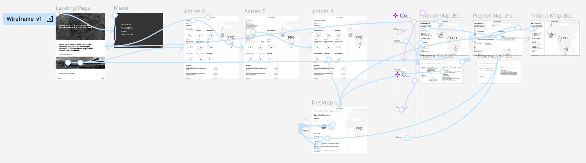
Early Prototyping
Prototyping helped us find appropriate solutions throughout the design process. For example, we discovered that while larger interactive components, such as an overlay modal, provided ample space for project details, they also obscured the map. To determine if this would be too disruptive to the usability of the map, we began our next iteration where we defined the role of the map more clearly, and its relationship to other information and components.
Iterations of the Partner side panel to determine appropriate information, layout, and interactions
Early low fidelity prototype logic
Low fidelity prototype used to test early concepts
Solving Design Challenges
Mapping Sub-Saharan Africa
During the design process, two challenges with the map arose. First, displaying country borders was problematic due to disputed boundaries. As users should already be familiar with their area of interest, country borders were removed to avoid confusion or contention.
Second, overlapping projects caused visibility issues, with some areas having dozens of projects that would require excessive zooming to differentiate. To address this, the project points were given padding and distributed evenly around their central locations. However, this led to a misleading impression that the placement of these points was precise to their location. To clarify that the points were not exact, they were arranged as a collective ring around their central location.
Example of areas with dense volume of projects packed around their central location
Progression of tooltip designs
Final map tooltip
Visual Design & Refined Prototyping
Merging Aesthetics
This project was a collaboration of two organizations, which was a unique challenge to create something by blending both identities. To capture the unique qualities of each brand, we studied the text styles, color usage, photo treatments, and navigation elements across their sites and considered how they could complement the data and each other.
CGIAR leverages a full-spectrum color palette, with rich warm and cool hues representing different themes across their work. We embraced this palette to encode primary information, using gold to highlight climate projects and red to signify project partners.
CIAT’s aesthetic is rooted in a monochromatic scheme of vibrant blues, which lent itself well to representing data on a linear scale. We used this cooler palette to encode secondary information about the projects, such as the number of beneficiaries or project budgets, which were applied to projects in the side panel list and their respective points on the map. Additionally, we incorporated their signature line iconography into text-based sections, such as the Project Details panel, to add visual interest.
Testing the Experience
As the UX, UI, and visual design elements came together, we created a refined prototype to ensure all design choices were cohesive and aligned with the intended user experience. This iteration also served as a valuable tool for communicating specific design decisions and interactions with the development team.
Collection of elements and styles from client sites used to craft a cohesive aesthetic
High fidelity Figma prototype
High fidelity Figma prototype logic